Questions about the exhibit:
1. what is the title of the exhibit?
Answer: The title of the exhibit was “The Sea around us".
2. What is the theme of the exhibition?
Answer: Water, the importance of water. Water covers 70% of the planet.
Step 2: The Gallery
Questions about the physical space:
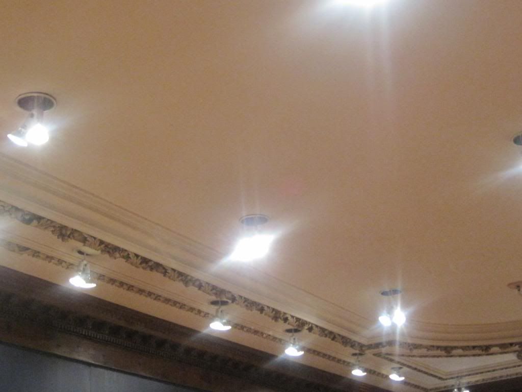
1. what type of lighting is used?
Answer: Florescent lighting that aligned the border of the ceiling, that projecting off the paintings.
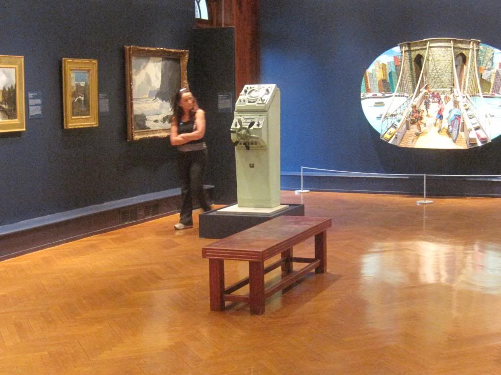
2. What colors are used on the walls?
Answer: The wall was a dark blue color, complements the theme “The Sea around Us".
3. What materials are used in the interior architecture of the space?
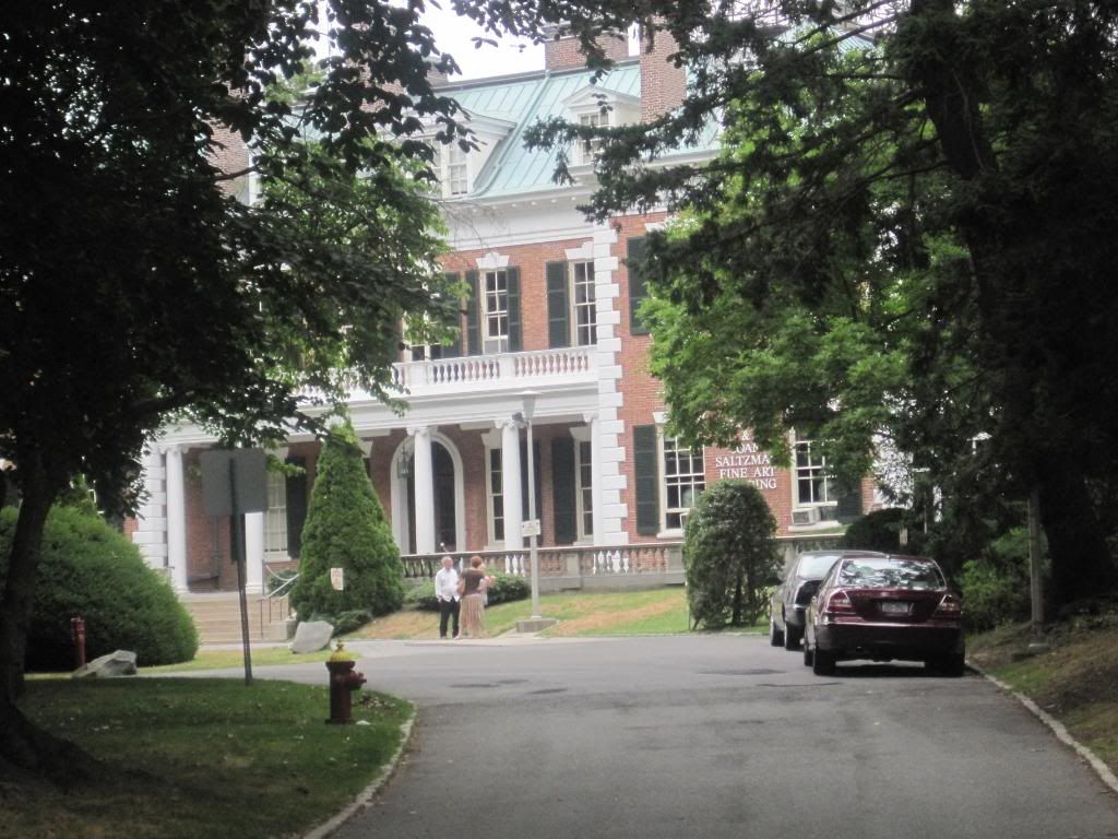
Answer: The museum was a Georgian style house, decorative border was made out of wood, gold paint was used to accent the ceiling (gilding), and wood for the floors.
4. How is the movement of the viewer through the gallery space?
Answer: The viewer can move very easily throughout the gallery space because the gallery space is clear of any distractions and clutter.
http://i1191.photobucket.com/albums/z477/jnoble4/nassaucountyartmuseum.jpg
http://i1191.photobucket.com/albums/z477/jnoble4/thegallery2.jpg
http://i1191.photobucket.com/albums/z477/jnoble4/lighting.jpg
Step 3: The Artwork
Questions about the artwork:
1. how are the artworks organized?
Answer: Side by side, eye level, by size. The largest piece was in the front of the room and the largest piece on the side of the gallery was usually on the end of that particular side.
2. How are the artworks similar?
Answer: The artworks all have water and show how water impacts are daily activities.
3. How are the artworks different?
Answer: The use of water is depicted in various ways.
4. How are the artworks framed?
Answer: The artworks have a gold border to complement the paintings.
5. How are the artworks identified and labeled?
Answer: The painter's name, the number of years they were alive, title of the painting, the type of paint used, and collection information.
6. What is the proximity of the artwork to each other?
Answer: They were a least two feet for each other. They were spread out throughout the room evenly.
Step 4: Art Criticism Exercise
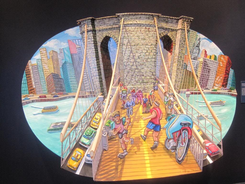
1.Red Grooms' Joseph's Bridge, 2004
Acrylic and wood
Gary& Marilyn Hollinger
Analysis: One of my favorite pieces throughout the gallery and exhibit. The painting was an installation depicting the Brooklyn Bridge and the bustle of New York City. People are of different racial ethnicity are depicted bicycling, jogging, pushing a stroller, hugging. There are taxis and vans on the bridge and Tugboats and cruisers in the water. After closely analyzing the painting, I observed the Africans Americans to be overweight in the painting. Unfortunately, I feel the painter was going by factual information. In terms of elements and principles used, I feel the artist did an excellent job balancing the painting by putting all aspects of the city live in the painting. He used yellow as the boardwalk color, creates an excellent contrast between the foreground and background. Overall, he uses bright colors, to draw the viewers into the piece. The boardwalk stands out of the painting, to put more emphasis on the boardwalk and bridge.
http://i1191.photobucket.com/albums/z477/jnoble4/exhibtsports.jpg
2. Artisit: John F. Simon Jr.
Title of work: Endless Victory
Media: Software, Apple Powerbook G4 and acrylic plastic
Size: N/A
Date: 2005
This piece of art has there squares the one on the bottom is white that is in the position of a diamond and the middle one is blue that is layered like a normal square and the top one is multi colors of red yellow white that is the power book and is layered in the diamond position. There is always movement of the details that are in the top square. Line is as symbols in this piece it also has implied shapes such as the squares. The frames force the viewer to look across the pieces. The light of the software emphasizes certain things at different times. He uses primary colors, red yellow and blue to draw attention to the top square. When certain images are played he uses space to create a 3 or 4 dimensional feel. The new images of everyday shapes that pop of reminds me that there is always something new in life to appreciate there is an endless number of choices one can make even if they are the simplest. I think the artist is trying to say is that things never ending he illustrates this with the constant movement in piece.
http://i1191.photobucket.com/albums/z477/jnoble4/012-1.jpg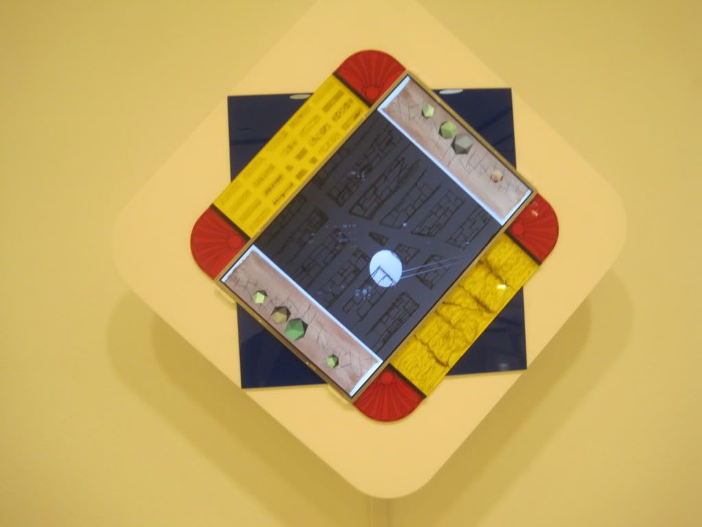
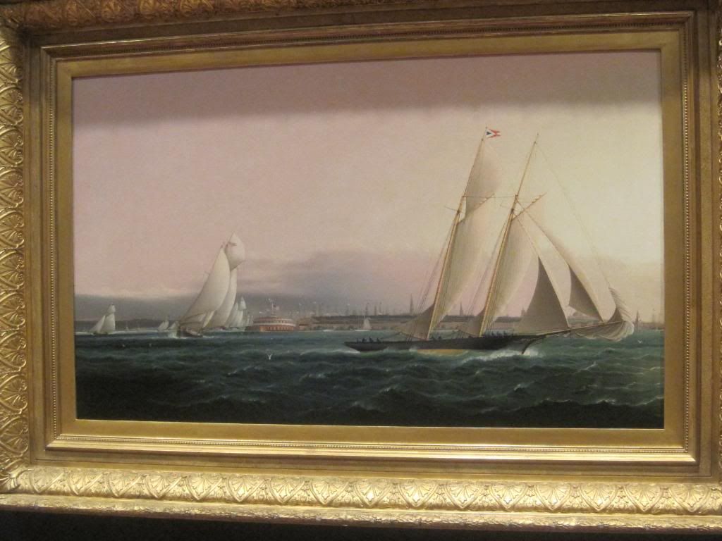
3. James E. Butterworth
The New York Yacht Club Schoorer,Resolute, Leading the fleet
Oil in canvas
Analysis: In this painting the yacht is leading the fleet against the waves. The background value of background creates an excellent contrast between the sea and background. The painter uses waves in the painting to capture the motion of the ocean; I feel the waves also provide texture for the painting. The artist paints clouds, to put an emphasis on the weather. Cloudy usually suggest bad weather. There are small ships painting in the background to emphasize the fleet and yacht. The yacht is painting bigger than the fleet, excellent proportion. He is using water to unify the piece.
No comments:
Post a Comment